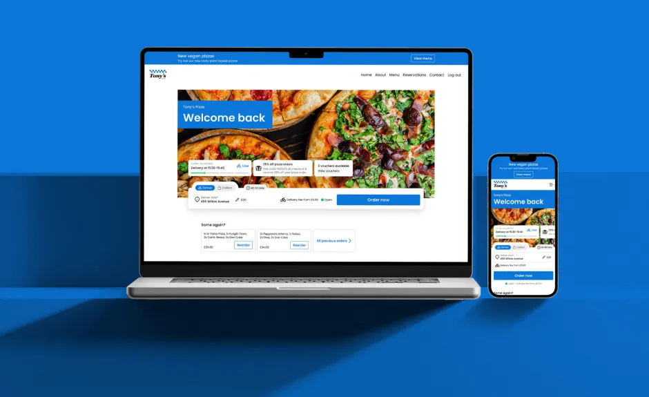
After months of research and testing, we’re excited to launch the next generation of our restaurant websites so you can offer your customers a unique, modern online ordering experience that mirrors your brand and that will help you drive more sales. To complement the new websites, we’re also introducing a website builder that will give you more control and flexibility over the look and feel of your website.
Redesigned from the ground up, your new website will offer more creative options to make your brand shine thanks to new, flexible design templates. We’ve also improved the user experience to make it easier for your customers to order (and re-order!) from you, and to track their orders in real-time. The new website builder will allow you to easily adjust copy, change colours, add images, create new pages, feature customer testimonials, and much more.
In this blog, (or video below if you prefer to watch!) we’ll cover the highlights of your new restaurant website and the exciting features of the website builder. Let's dig in 🍽️
Beautiful new website designs to elevate your brand
You’ve invested a lot of time building your image and we know how important it is to you to be able to showcase your brand on your website. We’re thrilled to introduce fresh new templates and styling options to suit your unique design needs.
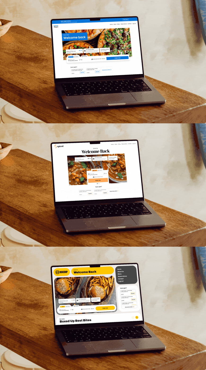
New website themes
You can now select from three new themes as the foundation of your website design. Those themes are fully customisable to your brand colours and include a selection of page components that can be turned on and off depending on the information that you want to display on your website. With a multitude of different ways to style your theme, your website will feel modern and unique. And this is just the beginning, we’ll be adding more themes and styling options in the future.
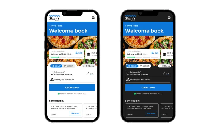
Dark mode is here!
Each of our new designs comes with a dark or light coloured scheme. At the click of a button, you’ll be able to change your website’s background colour and automatically update the colours of other components like buttons and links to fit your theme.
Flexible page layout options
Your new website now allows you to add different built-in page sections so you can customise the information displayed on each page to your liking.
You’ll be able to add:
A hero banner image to create a high visual impact
An about us section to communicate your story
A section to promote your mobile app so you can increase app downloads
Testimonials to share the great feedback from your customers
An interactive locations widget to ensure customers can find you
An informational banner to promote your latest discounts or share important news
A customisable image gallery
And much more!
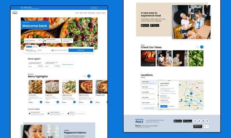
Order from the homepage, real-time order tracking and one-click re-order to boost user engagement
Taking all the learnings we have from our existing websites, we looked to introduce new capabilities into the user experience to drive better engagement and ultimately more orders. Here are three new features we’re sure your customers will love:
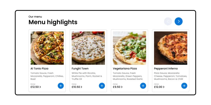
Add items to your basket – straight from the homepage
We’re now automatically pulling items from your menu onto your homepage so your customers can add them to their basket with a click. Once they’ve selected an item, customers will be taken to your checkout page where they can add more items or pay for their order — a simpler, more streamlined way to shop on your website.
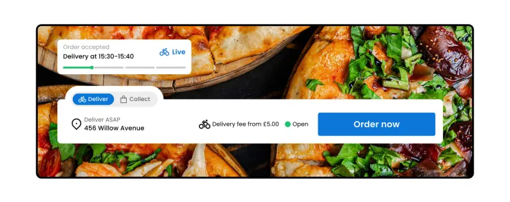
Real-time order tracking
Once a customer has put through an order, they’ll be able to track its status in real-time from your homepage. We’ll also display expected delivery times to manage your customers' expectations.
One-click reorder
Returning customers will love the new re-order function where their latest orders will be displayed. That way they can easily re-order their favourite meals without having to start an order from scratch.

A new website builder to adjust the look and feel of your website
Don’t know how to code? No problem! Managing and editing your website should be easy as 1-2-3. That’s why we’ve designed a super intuitive website builder that lets you make changes to your website yourself in a few clicks.
But most importantly, you’ll be able to see the changes you make before they go live, thanks to a new preview function. That way you can try new things on your website and don’t have to worry about messing it up. You can easily “undo” if you need to, and once you’re happy with your changes, you can publish them at the touch of a button.
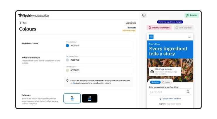
With the Flipdish website builder, you’ll be able to pick a design for your website, adjust colours, change the copy, add images, control your SEO, and much more. Making edits on the fly is a breeze, even on your mobile.
Creating new pages is also super simple. Just pick the type of page you want to create, give it a name, add your content, and you’re all set!
Learn how to edit your website the easy way
We know that editing your own website can be a bit daunting so we’ve created helpful resources to help you get started. You’ve got this!
Help Center articles
If you prefer to read, follow our how-to guides with screenshots and detailed instructions to learn how to edit your website.
Flipdish Academy website builder course
Our team is putting the final touches to a new Flipdish Academy video series to help you edit your website and publish your masterpiece. We'll update you once it's available in the next few days.
Publishing your new website: what you need to do
Your new website will be ready in the next few weeks. We’ll send you an email when it’s ready to preview. We’ve taken your existing website and transferred it onto our new website design. We’ve pre-selected a theme for you and adjusted it with your logo, your menu and your brand colours. But you are in full control of when your website will be published.
What that means is that you can make as many changes as you’d like before your website goes live. Or if you like what we’ve done, simply publish your new website. Once you publish your new website, your “old” website will be automatically replaced with the new one.
You’ll have until 1st July 2024 to publish your new website. By that date, if you haven’t published your new website already, we’ll go ahead and publish it for you.
Share your feedback with us
As we begin to roll this new update out, we’re looking forward to hearing your thoughts, feedback, and questions on the fresh new experience. We’ve made a significant effort to focus on what makes a great website and website builder for restaurants just like yours.
For a detailed overview of our new websites and website builder, Get in touch with our Sales team so they can give you a quick demo and show you how a website can completely transform your online presence and ordering experience.
If you’re an existing customer and seek more information, please contact your customer success manager who can help you get started quickly and easily.

