
We’re updating your mobile app to make it better-looking and a positive joy for your customer to use. At Flipdish we understand just how vital great menu design is - both online and on mobile.
Elegant intuitive design means:
- More customers getting all the way to their final order
- More revenue for your business
- Happy, satisfied customers who can find what they want and positively enjoy using your mobile app or website - and come back as a result
That’s why our product team is continually working to ensure your app is the very best it can be, and why we’re launching major new changes to how menu items and associated images are displayed and managed in your Flipdish app.
New menu design for your Flipdish mobile app
With this new design, we’re further optimizing the ways in which images and menu items are displayed:
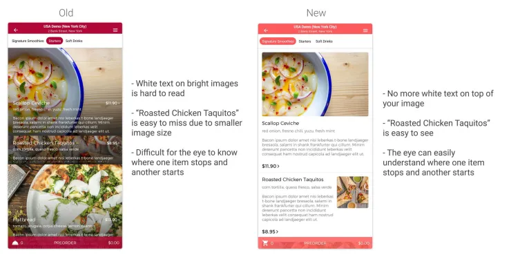
- Text is no longer replaced across images, improving legibility for your users
- We’re ensuring menu items with associated images are more clearly distinct from each other
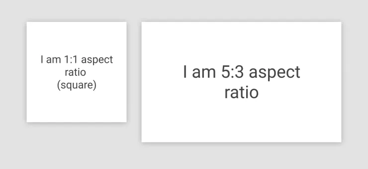
- Aspect ratio for images is now consistent across all platforms, meaning you upload once and your image looks great everywhere: no cropping or stretching, ever
Nothing communicates just how delicious your food is like a great image. But of course it’s still necessary to make dish names, price and allergen information as clear as possible.
Our new layout removes the text from the image and places it below, where it really stands out, no matter what image you use. We think it looks better, and when we tested it on real users they were quicker to get the information they needed.
This approach also helps develop a clearer separation between menu items. When multiple items with images associated with them appeared together, it could be easy to lose individual dishes, particularly those with small images between those with large ones.
As you can see in the image below, this update elegantly resolves this issue and gives every dish the star treatment it deserves.
Harmonising aspect ratio across all platforms
With this design update on your Flipdish mobile apps, we’re locking in the aspect ratios that we’ll use for menu items across our devices. That means you only have to upload once, and your customers see something perfect no matter what device they are on (and there’s hundreds out there nowadays).
To put it another way: less work for you, a better experience for your customers.
For large items, images should have a ratio of 5:3. This means that if you want your menu item image to be large, and you upload a 5:3 aspect ratio image, none of the image will be cropped and your customers will see the entire image, whether it’s on mobile apps, web, or kiosk. (Web and kiosk updates coming soon).
For small items, the aspect ratio will be 1:1, which is square. You can see an example in the image above. Again, if you upload a square image and set the image size to be small in your menu editor, the entire image will always show, and never be cropped or stretched no matter what.
What’s next?
We never stop. We’re a partner for growth and that’s a 24/7 job.
Once we finish the work on the mobile apps, we’ll implement similar updates for our website and embed code clients, as well as on our Flipdish self-service kiosks.
The end result will be a harmonious experience for your Flipdish menu images across the entire Flipdish platform.
